The Episcopal Church Women of the Diocese of Ohio needed a visual identity that honored a long legacy of faithful service while speaking with fresh confidence to a new generation of women in the church.
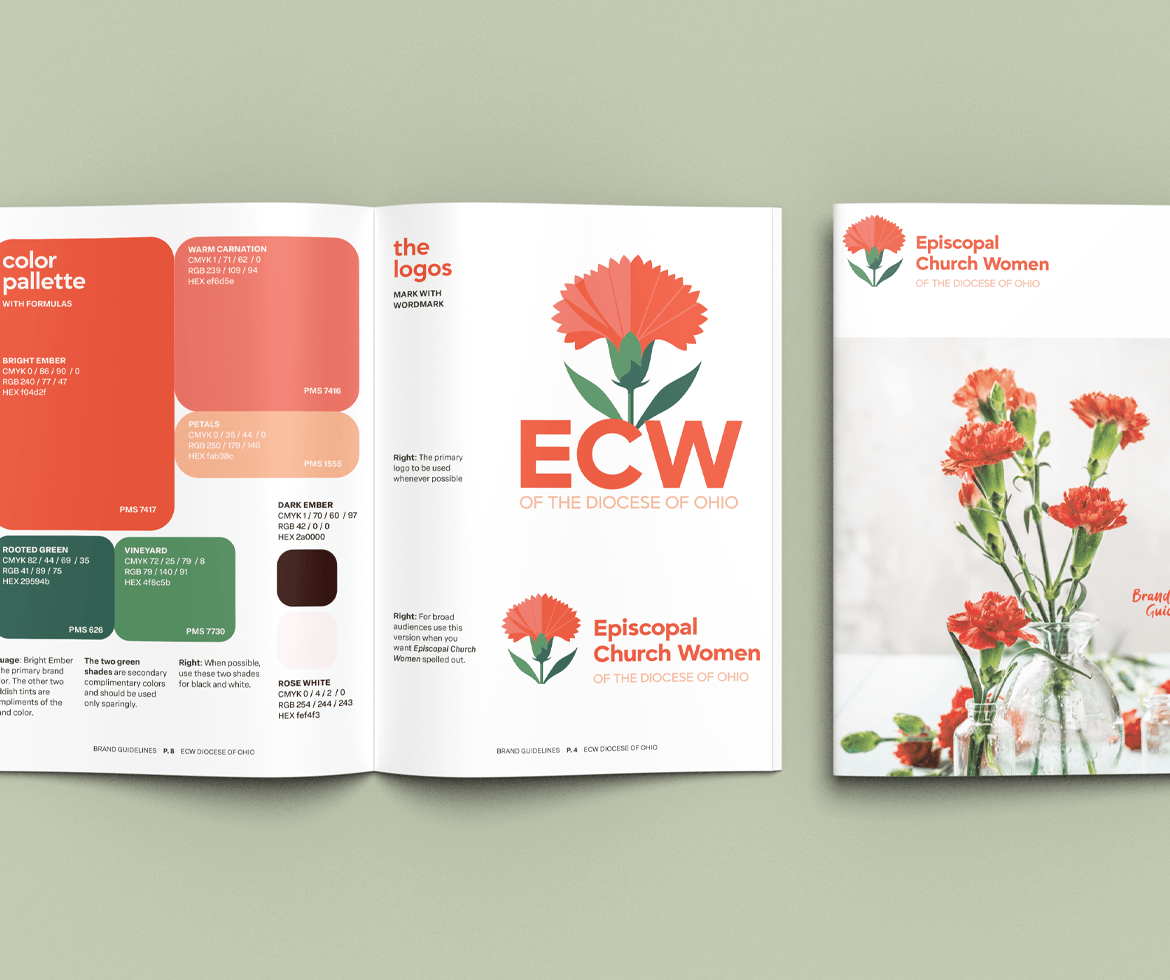
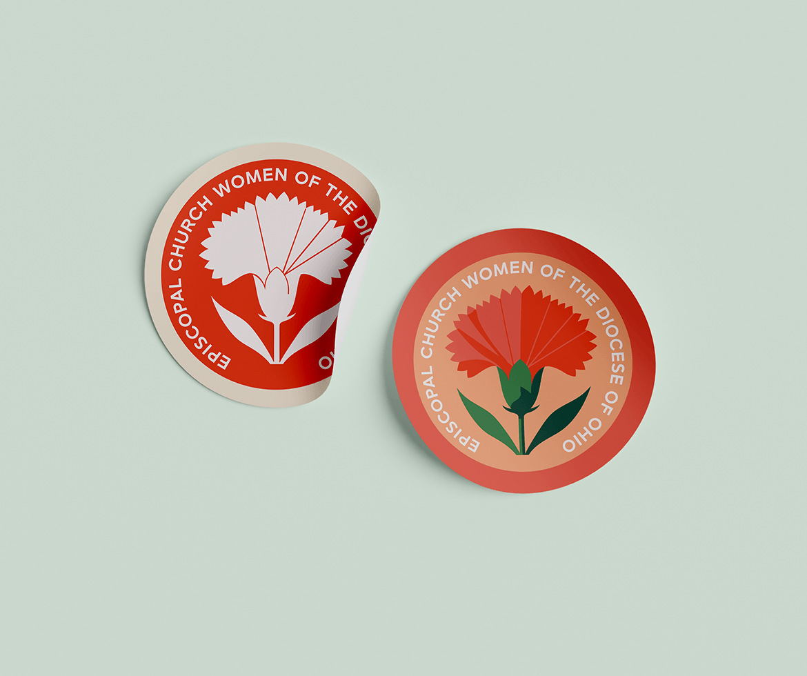
The carnation, Ohio’s state flower and a symbol of steadfast love, became the anchor for the entire system. Rendered in a bold, geometric style, it bridges the organization’s deep roots with a contemporary sensibility. The result is a mark that feels both historic and alive.
The brand system was built for real-world flexibility: a primary lockup for formal contexts, a horizontal version for broader audiences, and a circular badge for merchandise and community touchpoints. A warm palette of ember reds, soft pinks, and rooted greens keeps the system cohesive across print, digital, and event collateral.
The brand guidelines equip ECW chapters across the diocese to communicate with consistency and confidence — wherever they show up.